
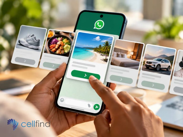
How WhatsApp Carousels can turn product discovery into a simpler, more relevant customer journey.
A customer is due for a contract upgrade. You know which devices they qualify for, what they currently pay and perhaps how much data they usually use. So you send: “You’re due for an upgrade. View our latest deals here.”
The notification has been delivered. The work has been handed to the customer. They now have to open a website, find the right section, filter out devices they cannot get and compare prices across several tabs. That is quite a lot to ask of someone who was just checking WhatsApp between meetings.
What if the message helped them make the choice instead?
More choice can mean more work
A catalogue is useful when someone wants to browse. It is less useful when they need to make a specific decision. Twenty phones on a page may offer plenty of choice, but the customer first has to work out which ones fit their budget and what distinguishes them.
Three relevant options tell a different story: lower monthly cost, more data, and a better camera. Each has a reason to be there. The customer can see the trade-off before opening another page.
A WhatsApp Media Card Carousel lets a business present a swipeable set of cards in a marketing template. Cards can combine an image or video, short copy and a button for the next action. Cellfind’s overview of the format describes up to ten cards. Ten is a limit, not a target. The aim is to show the right options, not everything in stock.
Give each card a reason to exist
For the upgrade customer, one card might show the most affordable eligible device; another, a model with a larger data allowance; a third, a stronger camera. The copy should explain the difference in terms the customer can use, including the monthly cost and the next step. Three nearly identical product photos with “Learn more” on every button leave the real comparison untouched.
The same approach works beyond telecoms. A hotel could show family rooms that match an enquiry rather than its entire room inventory. A vehicle dealer could present three trim levels the customer asked about. A retailer could suggest a small set of products related to an item the customer has viewed, provided it has an appropriate basis for using that information.
The image catches the eye, while the selection and explanation do the harder job: helping someone decide.
“Hi Sarah” is a greeting, not a recommendation
Putting a first name at the top of a generic offer is pleasant enough. It does not make the offer relevant. A customer looking for a family room still has to sort through the honeymoon suites if that is what the business sends them.
Useful personalisation starts with context. Is this person eligible for the upgrade? Have they asked about a particular price range? Are they comparing options for a family of four? Those answers can shape which cards appear and what each button does next. The business must also have the appropriate permission to use that information and contact the customer, with privacy controls that fit its own data practices.
This changes how the business thinks about messaging: instead of asking, “How many products can we show?”, ask, “Which decision is the customer trying to make?”
The tap needs somewhere useful to go
Imagine the customer chooses the camera-focused phone. The button takes them to a generic homepage. They search for the device again, find three contract variants and wonder whether the offer still applies. The carousel looked tidy; the journey has simply moved the mess one step along.
Map the next action before designing the cards. “Check availability” should lead to availability for that option. “Compare plans” should preserve the chosen device. “Speak to an adviser” should pass the selection and relevant context to the agent so the customer does not have to explain everything twice.
Cellfind’s Flow Builder tool can collect the information needed for the next stage of the customer journey, helping businesses move from a useful choice towards a completed task. Some tasks belong in a secure external application or need a person. A good hand-off takes the customer there with the right context; keeping every step inside WhatsApp is not a goal in itself.
People do not always follow the path designed for them. Someone may type, “Can I keep my current number?” instead of tapping a card. Another may need a different payment arrangement or have a question that the template cannot answer.
Before launch, test those moments. Where does a typed question go? Can an automated response answer it accurately? When does a person take over, and can that person see the selected card? Cellfind’s article on moving from chatbots to “choice-bots” looks at why guided choices and sensible escalation are more useful than an endless menu of automated replies.
The carousel is an opening to a journey, not the entire journey. Its job is to make the first useful choice easier.
Know when a carousel is unnecessary
A delivery alert does not need a row of cards. Neither does a one-time password or a straightforward account update. And someone trying to resolve a complaint probably wants a clear route to support, not a glossy selection of products.
Use the format where seeing and comparing a small number of meaningful options helps: devices, data bundles, travel packages, rooms, product variations or vehicle trims. Where one short message answers the question, send one short message. The richer format earns its place when it removes work from the customer’s side of the conversation.
Measure the decision, not just the swipe
The swipe depth and card taps show that people interacted with a message; they do not show that people got what they needed. Follow the journey: did customers check availability, complete a booking, submit an application or ask for help? Where did they stop? Did the new path create fewer confused support queries than the old catalogue link?
Compare the carousel with the previous way of presenting the same choices. If people tap a card and disappear at the next step, rewriting the card may not solve it. The form, stock information or hand-off after the tap may need attention.
Cellfind can help businesses connect WhatsApp carousel templates with messaging systems, automation and live support, while planning the route from a relevant option to a completed customer task. The opportunity is not simply to give customers more to look at. It is to make it easier for them to choose what happens next.
If your customers currently face too many links, messages or pages before reaching a useful option, speak to Cellfind about simplifying that journey.
